Hello Everyone! in this blog will discuss about CSS Flexbox properties in details to get the knowledge.
Let's start the learning process
1. display: flex
The basic syntax to use in the main section
.container {
display: flex;
}
By this syntax flex property will be enabled for both the container and the elements inside the container.
And the output will be by default row wise as per the output screenshot shown below.
Output:
flex-direction: row

After display flex command the elements will be aligned row wise by default and there are some more options can be enabled.
flex-direction: row(default)
flex-direction: column
flex-direction: row-reverse
flex-direction: column-reverse
- row: Flex items will be laying out from left to right and this is by default.
- row-reverse: this is exactly opposite to i.e., from right to left.
- column: this is the same as the row but top-bottom.
- column-reverse: this is the same as the row but bottom-top.
2. flex-wrap
This property allows the items to wrap as needed. Flex items try to fit on one line.
.container {
  flex-wrap: no-wrap | wrap | wrap-reverse;
}
no-wrap: all the items will be on one line. This is by default.
wrap: all the items will be wrapped into multiple lines from top to bottom.
wrap-reverse: this is the same as a wrap but from the bottom-top.
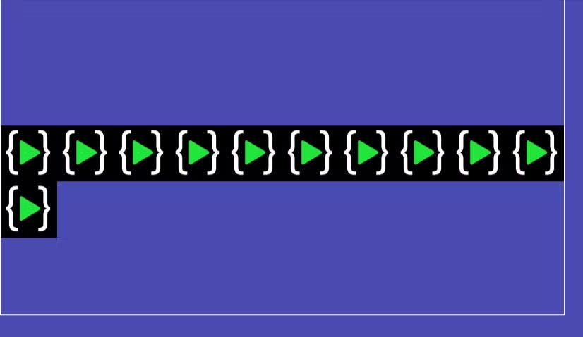
flex-wrap: wrap
output:

3. justify-content
This property allows for aligning the items along the main axis.
.container {
  justify-content: flex-start | flex-end | center | space-between | space-around | space-evenly |
}
flex-start: items are packed toward the start of the flex direction. This is by default.
flex-end: items are packed toward the end of the flex direction.
space-between: items are evenly distributed in the line; the first item is on the start line, and the last item is on the end line.
space-around: items are evenly distributed in the line with equal space around them.
space-evenly: items are distributed so that the spacing between any two items is equal.
justify-content: center
output:

4. align-items:
This property allows for aligning the items along the cross axis(vertical axis).
.container {
  align-items: stretch | flex-start | flex-end | center | baseline | start | end |
}
stretch: stretch to fill the container. This is by default.
flex-start/start: items are placed at the start of the cross axis.
flex-end/end: items are placed at the end of the cross axis.
center: items are placed at the center of the cross axis.
baseline: items are aligned such as their baselines align.
align-items: flex-end
Output:

5. align-self:
This property allows for aligning one specific item along the cross axis.
.element-3 {
  align-self:  flex-start | flex-end | center | baseline | stretch;
}
- All the property of align-self is the same as of align-items.
.element-3 { align-self:center }
Output:

6. align-content:
This property defines how each line is aligned within a flexbox container. It only applies if flex-wrap: wrap is present and if there are multiple lines of flexbox items.
.container {
   align-content: flex-start | flex-end | center | space-between | space-around | space-evenly | stretch |
}
- flex-start/start: items packed to the start of the container.
- flex-end/end: items packed to the end of the container.
- center: items packed to the center of the container.
- space-between: items evenly distributed; the first line is at the start and the last line is at the bottom.
- space-around: items evenly distributed maintaining equal space around each line.
- space-evenly: items evenly distributed maintaining equal space around them.
align-content: center
Output:

7. gap:
gap property is not only for flexbox, it works in the grid and multi-column layout as well.
This property controls the gap between the flex items. It only controls the gap between the items not on the outer edges.
.container {
  display: flex;
  gap: 10px;
  gap: 10px 15px;
  row-gap: 10px;
  column-gap: 15px;
}
Output:

8. order:
This property targets individual items and changes where they appear in the visual order with the order property.
.container :nth-child(1) {
  order: 3;
}
.container :nth-child(2) {
  order: 1;
}
.container :nth-child(3) {
  order: 2;
}

9. flex-grow:
This property defines the ability of a flex item to grow if necessary. It dictates what amount of the available space inside the flex container the item should take up. Flex-grow is basically for what percent width will get this element considered to others in max-width.
.item-3 {
    flex-grow: 2;
}
Output:

Flexbox has so many properties but in this blog, I covered the most used and common flexbox properties which are regularly used. If you are interested to know more about flexbox, Then follow the below links:

